Your Business Already Has Automation, They're Called Bob
Most businesses do not realise how much of their operation depends on undocumented human processes until the person holding it together goes on holiday.
Read →
When the dashboard isn’t clear, the explanation moves elsewhere.
You present the dashboard.
Then you open PowerPoint to explain it.
That’s the problem.
Not because the data is wrong.
Not because the audience isn’t capable.
But because the story isn’t clear.
That’s not a presentation problem.
That’s a design problem.
It happens everywhere:
A second layer gets added, usually in slides, sometimes just spoken.
So now you don’t have:
You have:
And over time, the meaning drifts.
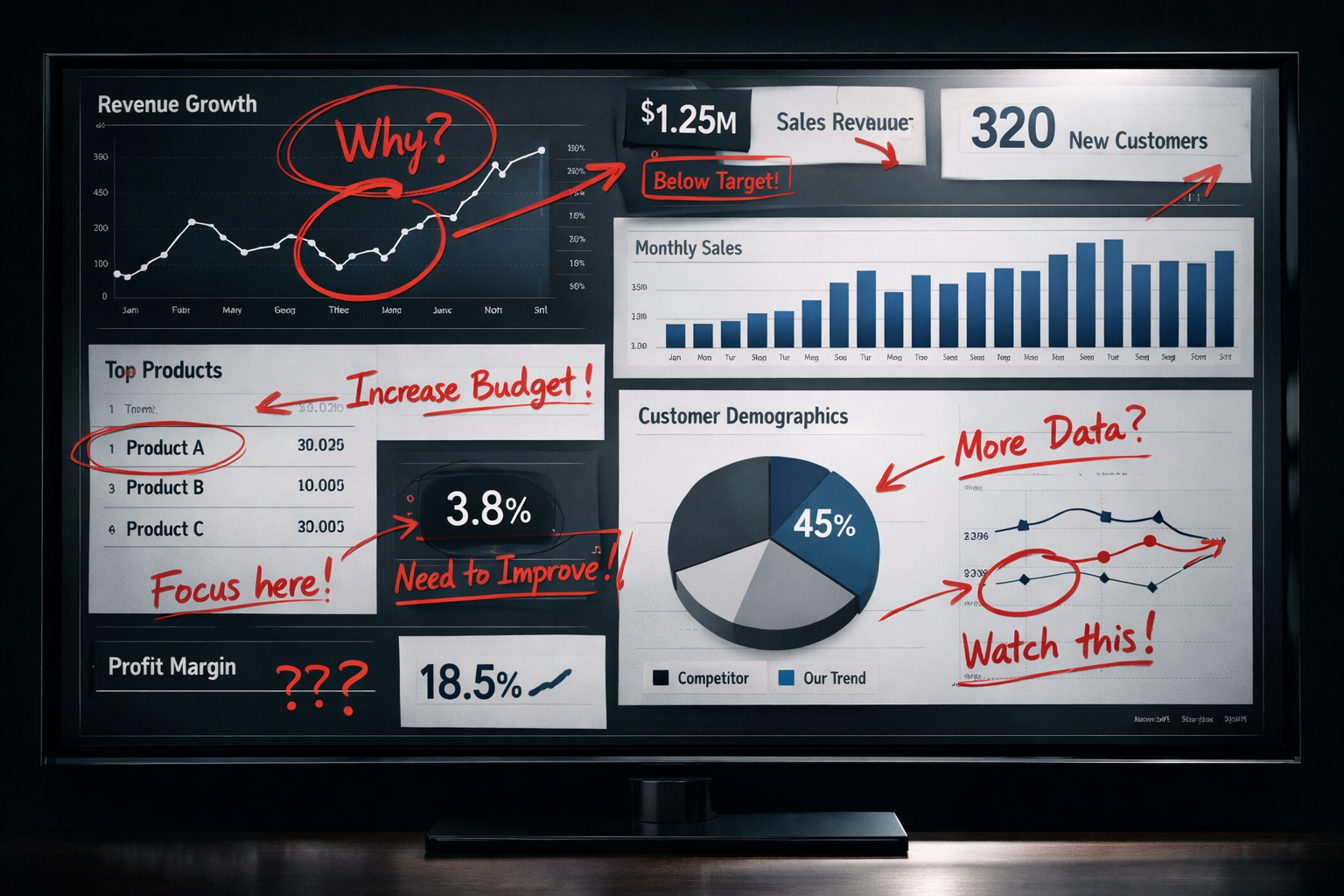
A service team is reviewing performance.
The dashboard shows:
Everything looks solid. Clean. Accurate.
But in the meeting, the questions start:
So the presenter steps in.
They explain:
None of that is visible in the dashboard.
So after the meeting, a slide deck gets created:
Now the real story lives outside the dashboard.
Most dashboards answer:
“What data do we have?”
But leaders are asking:
“What does this mean, and what do we do about it?”
If your dashboard doesn’t answer that clearly, someone will step in and fill the gap.
That gap is where PowerPoint lives.
This isn’t just about extra work.
It introduces:
The system stops being the decision-maker.
The presenter becomes the system.
A finished dashboard doesn’t need narration.
It makes three things immediately clear:
Without explanation.
Without a walkthrough.
Without a safety net of slides.
Three small but powerful changes:
Design for decisions, not visibility
If a visual doesn’t support a decision, it’s noise.
Remove interpretation gaps
If you feel the need to “talk over” the dashboard, it’s not done yet.
Make action obvious
Good reporting doesn’t just inform, it directs attention.
If your process looks like this:
Dashboard → Explanation → Decision
You haven’t finished the dashboard.
You’ve just moved the thinking somewhere else.
And that’s where reporting fails.
Most businesses do not realise how much of their operation depends on undocumented human processes until the person holding it together goes on holiday.
Read →Most splinter spreadsheets do not begin with bad intentions. They begin with urgency. Over time, unofficial tracking files quietly fracture operational truth across the business.
Read →Confusion is rarely accidental. It’s often the result of deferred decisions, vague ownership, and flexible definitions. Clarity doesn’t emerge by chance; it is deliberately designed.
Read →